The Problem
Loading and button issues
Returns process is difficult to find
White space at the bottom of homepage makes it look unfinished
Website and app is overwhelming to look at
The ‘shop the look section’ needs improving

The Solution
Mobile app and desktop compatible screens including the home page, cart, shop section, and wishlist.
Homepage: To ensure the app less overwhelming, I made a 'shop Instagram’ section and a simplified layout with clear subheadings headings.
Out of stock notification: Users shared their frustrations that items were not clearly identified when they are out of stock, so I created a clear out of stock banner and notification button.
Similar items and recently viewed: To make the app more user friendly, I created a ‘similar items’ and ‘recently viewed’ section.
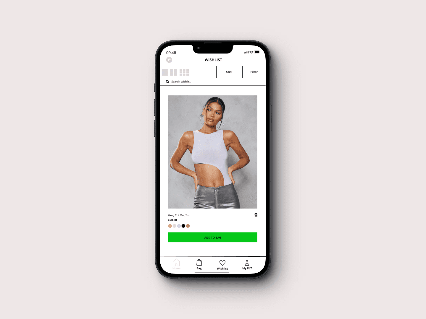
Wishlist: To ensure the app was accessible and user-friendly, I added a widget to show items in different viewpoints, a ‘search wishlist’ option, and a simplified option to delete items.
Checkout: Users shared that the checkout process was very confusing, so I simplified the layout.
Accessibility: One visually impaired user shared that both the PLT app and website are not accessible due to no dark mode option. Therefore, I made a dark mode option to combat this issue.
The Result
This PLT redesign was my first case study. Throughout this process I learnt a lot that I will take forward into my future projects. To drive forward this case study, I used the Double Diamond research method which helped me structure this case study in a methodological order, allowing clear communication with users and an overall better understanding of the process to create the best results.
One of the biggest challenges faced through user research was the platform being too overwhelming to use and not accessible. To combat this issue, I simplified the layout making it a lot easier for users to navigate their way through the app and overall creating a less stressful experience and I created a dark mode option.
During this process I learnt the importance of simplifying the steps during the usability testing phase as some users found it hard to understand the instructions. Overall, this experience has been eye opening as I discovered a lot. Moving forward, I will make the process much smoother and simplified for myself and the user.
Thanks for reading.
Framer
© 2024 Tamika Arnold.


